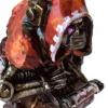
apologist Posted November 4, 2020 Author Share Posted November 4, 2020 (edited) Lovely. The skull has a truly disturbing effect that I feel many chaplain skulls do not which is also enhanced by the silver. Compared to his kin, he seems a grotesque gargoyle and wise elder with his stance of measured restraint. The shortening of the Phobos barrel is really nice, the level of detail that enhances the conversion. Thanks very much – I'm pleased with the effect; I had originally intended to use an existing Chaplain head, but after seeing the similarity of the halo on the Sanguinary Guard head, I'm glad I went for the sculpting approach. Gives him a nice unique quality, too. +++ Anyway, without further ado: + Chaplain Savonarola (Amaliel 7:13)+ Unlike most of this project, the inspiration for this Chaplain came not from the Games Workshop Studio army of WD139, but from the Dave Gallagher artwork that graced the cover of the Warhammer 40,000 Compendium (and which inspired my Captain Tycho conversion earlier in the thread. One of the supporting elements in this painting is a curious silver-coloured Chaplain. It's a very distinctive look that I don't think has turned up elsewhere, but works really nicely. It's particularly suitable for the Blood Angels, I think, as it complements the golden armour of their heroes and champions and contrasts with the black armour of their Death Company. Appearing as it did at the back end of Rogue Trader, the image differs from the black-armoured Chaplain of the studio army and elsewhere; but it's such a striking look that I wanted to include it. Of course, this raised the question of whether to tackle it with non-metallic metal (NMM) techniques – as in the original artwork – or with metallic paints. The former would have worked well alongside my Captain Tycho, where I used a NMM approach; while the latter would sit better alongside the rest of the army. Unable to decide, I split the difference and decided to experiment, using metallic paints alongside non-metallic paints to create a halfway house. He was turned around in an evening; and I'm pretty pleased with the result. I'll certainly call it a successful experiment. My friend Omricon suggested the technique might suit Stormcast, too; which is a good idea. Figures painted completely with metallics can look a bit unfinished, so I made sure to include some other textures, such as the cloak lining, purity seals and weapons. The half-seen three-skull motif on the shoulder pad and torso is visible nicely here. It was applied with dilute Payne's grey ink. This close-up demonstrates how the metal and non-metal areas intersect. Figures painted completely with metallics can look a bit unfinished, so I made sure to include some other textures, such as the cloak lining, purity seals and weapons. Edited November 4, 2020 by apologist BadgersinHills, Lexington, Dr_Ruminahui and 19 others 22 Back to top Link to comment https://bolterandchainsword.com/topic/337560-nova-terra-interregnum-%E2%80%93-the-alien-wars/page/23/#findComment-5627445 Share on other sites More sharing options...
Lexington Posted November 4, 2020 Share Posted November 4, 2020 Striking! Really solid stuff. Link to comment https://bolterandchainsword.com/topic/337560-nova-terra-interregnum-%E2%80%93-the-alien-wars/page/23/#findComment-5627495 Share on other sites More sharing options...
Bjorn Firewalker Posted November 4, 2020 Share Posted November 4, 2020 The headdress makes the Chaplain look like Hordak, from She-ra: Princess of Power. space wolf 1 Back to top Link to comment https://bolterandchainsword.com/topic/337560-nova-terra-interregnum-%E2%80%93-the-alien-wars/page/23/#findComment-5627575 Share on other sites More sharing options...
StratoKhan Posted November 4, 2020 Share Posted November 4, 2020 The Chaplain works so well. Somehow he’s both eye catching and understated. The skulls on the breastplate are great. The helmet also painted up very well. Perfect addition to the army. Link to comment https://bolterandchainsword.com/topic/337560-nova-terra-interregnum-%E2%80%93-the-alien-wars/page/23/#findComment-5627631 Share on other sites More sharing options...
apologist Posted November 5, 2020 Author Share Posted November 5, 2020 Striking! Really solid stuff. Thanks :) The headdress makes the Chaplain look like Hordak, from She-ra: Princess of Power. Ha-ha – yes, I see what you mean. Funnily enough, I thought the face had an air of Skeletor from the awful 90s Master of the Universe film. Happily, both are entirely suitable period inspirations! The Chaplain works so well. Somehow he’s both eye catching and understated. The skulls on the breastplate are great. The helmet also painted up very well. Perfect addition to the army. Thanks for the feedback; much appreciated. Coming up next, the last character for the army. After this, it's just the Landspeeder to do! Urauloth, Deadass and Dosjetka 3 Back to top Link to comment https://bolterandchainsword.com/topic/337560-nova-terra-interregnum-%E2%80%93-the-alien-wars/page/23/#findComment-5627823 Share on other sites More sharing options...
K0rtmer Posted November 5, 2020 Share Posted November 5, 2020 Absolutely amazing. I was sceptical whether the the silver Chaplain would work, but it does. Really captured the essence of the artwork. Awesome. Link to comment https://bolterandchainsword.com/topic/337560-nova-terra-interregnum-%E2%80%93-the-alien-wars/page/23/#findComment-5627829 Share on other sites More sharing options...
apologist Posted November 6, 2020 Author Share Posted November 6, 2020 Absolutely amazing. I was sceptical whether the the silver Chaplain would work, but it does. Really captured the essence of the artwork. Awesome. Thanks, K0rtmer – kind of you to say. I was pretty unsure on whether it'd work, too! I think it's worked out fairly successfully. Certainly an experiment that I'd like to try again elsewhere. +++ Unlike the other characters, where there's either been kick-ass artwork or a classic model to build up my enthusiasm, the Librarian suffered from a lack of inspiration. It was also one of the first models I created for the army; before I decided to get more involved with the conversions. As a result, it's a relatively simple conversion based on the librarian model from WD139: I'm not a huge fan of this model, but then I'm not that enthused by any of the period Librarian models. There are some nice details, however. It's interesting to see that while the Techmarine symbol changed, the Librarian logo has remained the original horned skull. Unlike a lot of the army, I don't think this one has aged well. The halved scheme, with blue top and red bottom, looks awkward, and the whole figure has a simultaneously cluttered and oddly sparse appearance; with the purity seal and loincloth(?) looking a bit stuck on. My conversion involved using the (then-)new Primaris Librarian and reposing the arms. I converted the chest to make it a Mark VI torso, and swapped the head for something a bit decorative. The idea was for the robes to partially obscure the red legs. With red and blue both being used, I kept the robes neutral to avoid the figure becoming too busy. When considering how to paint robes, I tend to look at whether they're practical or ornamental. Here, the Librarian has both inner and outer robes. I decided to paint the outer one as a weatherworn leather, building up the colour with repeated stippling and washes. The inner robes were painted in a contrasting lighter tone, intended to frame the armour and provide a bit of visual pop. I added some ritualistic details (some Enochian letters) around the hem, and suggested a red decorative hem on the inside. The leather effect is clear here. I may have sounded a bit negative about this figure above; but this is a lot of lovely subtle details on the base sculpt, such as the decorated reinforcement where the split cape joins and the pipework joining the psychic hood to the backpack. I replaced the modern backpack with a period one. You can also see the decorative shoulder pad I added on the left here. It's from one of Forge World's Emperor's Children kits – these two highly-decorative Legions have lots of pieces that work well with each other's kits. I added a trussed bird to the banner (it's from the late-lamented Bretonnian Men-at-Arms sprue) as a suitably outré addition. I painted it up as a light-coloured pigeon, or dove. Perhaps he uses it as some sort of sacrifice, perhaps some sort of communication. Who knows? The little shield on the kit proved a great place to add the Company markings. The horned skull shoulder pad is part of the standard kit. I added his apotropaic name on the scroll, and added an Enochian sigil to the forehead of the skull. The split scheme can be seen nicely here. I'm glad I went for a robed figure. It allowed me to keep the homage to the original, while partially hiding a device I'm not the fond of! The robes also give a nice 'Obi Wan Kenobi' feel, which I like. The banner, as with the other personalities in the army, is a replication of the original. Deadass, Ryltar Thamior, Cadmus Tyro and 14 others 17 Back to top Link to comment https://bolterandchainsword.com/topic/337560-nova-terra-interregnum-%E2%80%93-the-alien-wars/page/23/#findComment-5628175 Share on other sites More sharing options...
BadgersinHills Posted November 6, 2020 Share Posted November 6, 2020 Excellent painting, the Librarian looks great. Your conversion enhances an already great model. For some reason the poor dear bird does make me a little sad, but even the great and distinguished pigeon cannot escape grimdark. Link to comment https://bolterandchainsword.com/topic/337560-nova-terra-interregnum-%E2%80%93-the-alien-wars/page/23/#findComment-5628190 Share on other sites More sharing options...
Xin Ceithan Posted November 6, 2020 Share Posted November 6, 2020 Excellent painting. I particularly like the robes and the little details.Also, using the robes to keep the uncharming RT colour scheme (especially when you know what to look for) while back staging it enough not to distract from the rest of. The mini and the details is indeed a great idea. This is really a character piece in every sense of. The word, Link to comment https://bolterandchainsword.com/topic/337560-nova-terra-interregnum-%E2%80%93-the-alien-wars/page/23/#findComment-5628268 Share on other sites More sharing options...
Sandalphon Posted November 7, 2020 Share Posted November 7, 2020 I would like to have seen a mkVI helmet on him but I could say that about every marine out there :P All the small details bring it together and the original colour scheme has been suitably grimed, another great addition to the force. Link to comment https://bolterandchainsword.com/topic/337560-nova-terra-interregnum-%E2%80%93-the-alien-wars/page/23/#findComment-5628529 Share on other sites More sharing options...
apologist Posted November 9, 2020 Author Share Posted November 9, 2020 Excellent painting, the Librarian looks great. Your conversion enhances an already great model. For some reason the poor dear bird does make me a little sad, but even the great and distinguished pigeon cannot escape grimdark. Cheers! A little melancholy goes a long way in a Librarian, I think; but perhaps he's just trussed up temporarily to keep him safe? :) Excellent painting. I particularly like the robes and the little details. Also, using the robes to keep the uncharming RT colour scheme (especially when you know what to look for) while back staging it enough not to distract from the rest of. The mini and the details is indeed a great idea. This is really a character piece in every sense of. The word, Very kind, ta. I would like to have seen a mkVI helmet on him but I could say that about every marine out there All the small details bring it together and the original colour scheme has been suitably grimed, another great addition to the force. Sorry; no Corvus helm here... but perhaps I can make it up to you with a picture of the Techmarine and thudd gun together? Realised I hadn't posted any of the pair: When texturing the large 80mm base, I left a subtle space for the techmarine to slot on, which helps the two to be clearly associated. I also have good news: I painted the Land Speeder last night, so the army is – at long last – finished! Dosjetka, Xin Ceithan, Sandalphon and 11 others 14 Back to top Link to comment https://bolterandchainsword.com/topic/337560-nova-terra-interregnum-%E2%80%93-the-alien-wars/page/23/#findComment-5629254 Share on other sites More sharing options...
Sandlemad Posted November 9, 2020 Share Posted November 9, 2020 Looks great. I'd second the point about the robes mollifying the oddball halved scheme. Really like the way you've distinguished the outer and inner robes, like some sort of duster/foul weather gear over ritual garb. Business outside, party underneath. The bird's a charming addition as well, gives it a hint of Blanchian strangeness. Doves feel appropriate for the BA and your rationale for why he might have the bird to hand is fine as well but it does add a little Merlin from Sword in the Stone energy. Sandalphon and apologist 2 Back to top Link to comment https://bolterandchainsword.com/topic/337560-nova-terra-interregnum-%E2%80%93-the-alien-wars/page/23/#findComment-5629272 Share on other sites More sharing options...
Bjorn Firewalker Posted November 9, 2020 Share Posted November 9, 2020 Excellent work on the thudd gun and its gunner. apologist 1 Back to top Link to comment https://bolterandchainsword.com/topic/337560-nova-terra-interregnum-%E2%80%93-the-alien-wars/page/23/#findComment-5629399 Share on other sites More sharing options...
apologist Posted November 10, 2020 Author Share Posted November 10, 2020 (edited) + Land Speeder + The crew and speeder itself are painted with slightly different techniques, so while the palette is common between them, the resulting hue is subtly different. The idea behind this is that the Astartes' own armour is treated differently from the vehicle pool. I've tried to emphasise the nature of the vehicle as a piece of equipment by adding little warning symbols below hatches and above the intakes, as you can see above. As with the Rhino [+noosphericinloadlink embedded+], I used a stippling technique to build texture on the Speeder. This gives an appearance evocative of WWII-era cast-iron tanks; which strikes me as pleasingly anachronous. The Marines, meanwhile, have a smoother, finer finish. Close study of the inspiration shows that the left-hand figure had a yellow hand symbol painted on his pad, and a striped leg. I didn't realise it at the time, but this is presumably marking him out as a techmarine. As with Brother Mirandola [+noosphericinloadlink embedded+], I changed the Rogue Trader-era hand symbol for the modern Opus Machina skull-in-cog. This was particularly interesting (well, in a very trainspottery way) to me because I'd wondered where all the techmarines were. The old army lists required multiple techmarines – one for each vehicle – but the painted army didn't seem to include them. Having one present on the Land Speeder makes things a lot more clear; they were mostly hidden within the vehicles, piloting them. That might also answer another question – why does the pilot have yellow shoulder pads? I had assumed that this was a simple aesthetic flourish, or perhaps a precursor to the later idea that most Land Speeders were attached from the 8th (Assault) Company, the colour of which is yellow. Looking back over the army list, it may be that this figure represents the Lieutenant – another figure that's present in the army list (a Lieutenant was compulsory during the later Rogue Trader period) but missing from the army as a physical model. That's confirmed by Andy Chambers' notes in the later battle report, where he writes that 'the Lieutenant acted as gunner on board the Land Speeder, accompanied by a single techmarine.' It's funny; I must have read that report dozens of times, but it had never clicked with me that the Speeder crew was always planned and painted up to be a Lieutenant and techmarine – it wasn't just a quick way to justify not having those models painted. I should have had more faith! I included the yellow tip on the multimelta. Not only is that a pretty iconic look for the period, but it added an important point of interest to an otherwise fairly simple model. The army badge (blue circle) is present on both crew and speeder, though it's much reduced – it was massive on the original. On the other side we can see further markings – a little bit of freehand helps to add interest to big black areas. The model is Forge World's own retrohammer reimagining of the original; and I'm pleased to see that they kept some of the large blank areas of the original. It's nice to have space and opportunity to play around with texture and freehand. The front. The techmarine's hazard-stripe greave has been reduced to a stripe in my interpretation, and he's got a Mark IV helm – just to help the model to blend in with the army. The Lieutenant is Mark VI accurate, just like the original. I enjoyed painting the yellow; even round the studs. As a little fun flourish, I painted the large scanner/screen in front of the techmarine with a detail of the battle report in WD141; simplifying things to red spots for the enemy Eldar and white for friendly forces. I should probably have added more contrast to the hills, as they're kinda lost – but then as it's just a bit of fun, it doesn't matter too much. Edited November 10, 2020 by apologist Bjorn Firewalker, BadgersinHills, Xin Ceithan and 12 others 15 Back to top Link to comment https://bolterandchainsword.com/topic/337560-nova-terra-interregnum-%E2%80%93-the-alien-wars/page/23/#findComment-5629716 Share on other sites More sharing options...
Lienna Posted November 10, 2020 Share Posted November 10, 2020 I think the recreation of the battle report map on the scanner screen may be the perfect stroke of mad genius! Great work! Sandalphon and Xin Ceithan 2 Back to top Link to comment https://bolterandchainsword.com/topic/337560-nova-terra-interregnum-%E2%80%93-the-alien-wars/page/23/#findComment-5629721 Share on other sites More sharing options...
Mandragola Posted November 10, 2020 Share Posted November 10, 2020 This is a really nice blog overall. Great job on the crew and paint of that land speeder. Would you consider raising the multimelta slightly? I'd be a bit worried about the crew having their heads melted, perhaps resulting in reduced performance. Xin Ceithan 1 Back to top Link to comment https://bolterandchainsword.com/topic/337560-nova-terra-interregnum-%E2%80%93-the-alien-wars/page/23/#findComment-5629728 Share on other sites More sharing options...
deathspectersgt7 Posted November 10, 2020 Share Posted November 10, 2020 Landspeeder looks great. Link to comment https://bolterandchainsword.com/topic/337560-nova-terra-interregnum-%E2%80%93-the-alien-wars/page/23/#findComment-5629749 Share on other sites More sharing options...
BadgersinHills Posted November 10, 2020 Share Posted November 10, 2020 Love the Land Speeder, and the Thudd Gun is so cool! :) Link to comment https://bolterandchainsword.com/topic/337560-nova-terra-interregnum-%E2%80%93-the-alien-wars/page/23/#findComment-5629891 Share on other sites More sharing options...
apologist Posted November 11, 2020 Author Share Posted November 11, 2020 I think the recreation of the battle report map on the scanner screen may be the perfect stroke of mad genius! Great work! Ha ha – thank you! This is a really nice blog overall. Great job on the crew and paint of that land speeder. Would you consider raising the multimelta slightly? I'd be a bit worried about the crew having their heads melted, perhaps resulting in reduced performance. Very kind, ta. I do agree about the rather dubious design practise of having a thermonuclear radiation-cannon mounted directly behind the crew, but I think it's part of the retro charm. The problem is exacerbated by my decision to enlarge the crew to Primaris proportions (that was a pain!), so perhaps I'll have another look. (Rather like the phrase 'reduced performance', by the way! :D) Landspeeder looks great. Ta :) Love the Land Speeder, and the Thudd Gun is so cool! Thank-you. Ryltar Thamior and Mandragola 2 Back to top Link to comment https://bolterandchainsword.com/topic/337560-nova-terra-interregnum-%E2%80%93-the-alien-wars/page/23/#findComment-5630040 Share on other sites More sharing options...
Majkhel Posted November 12, 2020 Share Posted November 12, 2020 Really, really good job on the speeder!Primari-sized crew is really neat on it's own. Plus great colour palette with thought-out placing of yellow accents. Plus the fantastic paint-job and attention to details (the scanner... uh, man, that's soooo cool a touch!).I totally agree that stippling makes large plain plates sooo much more interesting. Once again, great job! :) apologist 1 Back to top Link to comment https://bolterandchainsword.com/topic/337560-nova-terra-interregnum-%E2%80%93-the-alien-wars/page/23/#findComment-5630337 Share on other sites More sharing options...
Urauloth Posted November 13, 2020 Share Posted November 13, 2020 Ok. I'm sold. Chaplains are silver now. The thudd gun painted up in chapter colours is the coolest thing in the world. It feels like a Heresy-era relic. I like how oily and scuffed you made it look compared to the armour of the Blood Angels themselves, too. I never liked the old landspeeder design (that crew seating that looks like an amusement park lawsuit waiting to happen) but you've given this one real charm, and made it look a lot more plausible as a piece of chapter equipment. The scanner is an incredibly good idea. I have to echo the concerns about the head-height gun placement though. :D As always, it's great to read the in-depth research into the armies of yesteryear. apologist 1 Back to top Link to comment https://bolterandchainsword.com/topic/337560-nova-terra-interregnum-%E2%80%93-the-alien-wars/page/23/#findComment-5630818 Share on other sites More sharing options...
apologist Posted November 13, 2020 Author Share Posted November 13, 2020 + Battleground: Anderr's Star + A hot wind blew in from the north, stirring the grasses. A great rushing sound swelled in the woodland as the strange air rushed through the trees and sent them waving; as though in silent alarm. In its midst stood a gold-armoured Space Marine, his crimson cloak likewise perturbed. Prince Dauhavron – Erasmus Tycho; First of that Name – turned the impassive mask of his helm to face the wind. Inside, clicks and warning chimes sounded alongside vox-request tones. Ancient runes crawled across Tycho's vision, marking the on-rush of hard radiation and spiteful gamma-rays. The vox-net erupted as his men began curt reports from across the valley. To his left, he saw brother Brunellecci hurriedly donning his own helm, his skin darkening protectively under the aegis of his melanchromic organ. Atomics. The greenskins had bombarded the city. Though it still stood clad in autumnal finery, the woodland was already dead; its potential curdled and soured in an instant. The gilt surface of Tycho's helm gleamed in the low, late sunshine; and the large black eye-lenses gave away nothing. He said not a word, but dipped his head to unholster his boltgun, and began to march north. BadgersinHills, Majkhel, Isengrin and 4 others 7 Back to top Link to comment https://bolterandchainsword.com/topic/337560-nova-terra-interregnum-%E2%80%93-the-alien-wars/page/23/#findComment-5630846 Share on other sites More sharing options...
space wolf Posted November 13, 2020 Share Posted November 13, 2020 The headdress makes the Chaplain look like Hordak, from She-ra: Princess of Power. Ha-ha – yes, I see what you mean. Funnily enough, I thought the face had an air of Skeletor from the awful 90s Master of the Universe film. You take that back! that is an excellent film! Always an inspiration, Apologist. I remember finding your stuff on the warseer boards. You've inspired me to do several projects, so thank you. apologist 1 Back to top Link to comment https://bolterandchainsword.com/topic/337560-nova-terra-interregnum-%E2%80%93-the-alien-wars/page/23/#findComment-5630857 Share on other sites More sharing options...
apologist Posted November 17, 2020 Author Share Posted November 17, 2020 Ok. I'm sold. Chaplains are silver now. The thudd gun painted up in chapter colours is the coolest thing in the world. It feels like a Heresy-era relic. I like how oily and scuffed you made it look compared to the armour of the Blood Angels themselves, too. I never liked the old landspeeder design (that crew seating that looks like an amusement park lawsuit waiting to happen) but you've given this one real charm, and made it look a lot more plausible as a piece of chapter equipment. The scanner is an incredibly good idea. I have to echo the concerns about the head-height gun placement though. As always, it's great to read the in-depth research into the armies of yesteryear. Thanks very much. When I started the project, I hadn't anticipated quite how many details (like the identity of the Landspeeder crew or the colour of the Chaplain) I'd find completely new or unfamiliar. Considering how much of my mis-spent youth was spent reading and re-reading these magazines and rulebooks, there's a wealth of information still in there! Really, really good job on the speeder! Primari-sized crew is really neat on it's own. Plus great colour palette with thought-out placing of yellow accents. Plus the fantastic paint-job and attention to details (the scanner... uh, man, that's soooo cool a touch!). I totally agree that stippling makes large plain plates sooo much more interesting. Once again, great job! Very kind; and I was particularly pleased with the scanner plate. That's old-school GW humour right there :) You take that back! that is an excellent film! Always an inspiration, Apologist. I remember finding your stuff on the warseer boards. You've inspired me to do several projects, so thank you. My brother loved Star Wars, but He-man was my favourite. I was so sad when the film didn't have any of the cool characters! :D Thanks for the kind words space wolf – I'm very much enjoying your new Rome-inspired Ultramarines. Great work! Link to comment https://bolterandchainsword.com/topic/337560-nova-terra-interregnum-%E2%80%93-the-alien-wars/page/23/#findComment-5632353 Share on other sites More sharing options...
apologist Posted November 17, 2020 Author Share Posted November 17, 2020 (edited) + The Dread Krell + 40k, like a lot of sci-fi, has a lot of fairly similar protaganist species. With the exception of the Tyranids, almost all of the main factions are humanoid. Also known as the Enslavers, the Krell are the perfect example of a non-humanoid alien species that hasn't really been seen since Rogue Trader – and they're a species that, frankly, I think are pretty much the coolest thing since sliced bread. I created the Alien Wars project with the idea that it'd give me a space to play around with less familiar forces, like the Saharduin and the Fomn. The project stems from a simple concept: what would X model/faction look like if it were released today? The weird, warp-based, gribbly, mind-eating tentacle monsters have had some cool hints as to their continued existence in 40k – they appeared as the Psyren in a couple of short stories, and some concept sketches and conversions appeared in a Creature Feature article in White Dwarf. Had you asked me a few years back, I'd have said there's no chance of seeing GW re-release them; but we've now seen the release of models like the ambull and zoats. I don't think it's beyond the realm of possibility that we'll eventually see official GW models. For the moment, however, I'll be using the rather delightfully grotesque figures from Tagged Events. Drawing heavily on the White Dwarf concept sketches I mention above, I got these as part of a Kickstarter, and the quality of cast is lovely – judging by the box they arrived in, they were cast by the excellent Artel "W". The design is slightly awkward, requiring quite a bit of hot water work (I'll try to get some shots when I build the remaining two), but I'm delighted with the results. The models are very fragile, and I'm very sceptical that the delicate tentacles would last any time at all in storage, let alone play. To help avoid (or at least minimise) damage, I've used wire to connect them to the bases to relieve the weight and pressure. I've also shifted them from the 40mm bases with which they were supplied to large 50mm bases. As well as helping to avoid overlapping the base edge, it also gives them a bit more table presence – fitting for these creepy invaders from being beyond reality itself! As mentioned, I love the design. The only reservation I have is that there are no options, and the head on the portal/gate figure. I trimmed it off mine, and I think its loss is a substantial improvement. Other than that, it's classic 50s style B-movie monsters from space, and I'm really looking forward to painting them. Edited November 17, 2020 by apologist Urauloth, BadgersinHills and Majkhel 3 Back to top Link to comment https://bolterandchainsword.com/topic/337560-nova-terra-interregnum-%E2%80%93-the-alien-wars/page/23/#findComment-5632355 Share on other sites More sharing options...
Recommended Posts
Create an account or sign in to comment
You need to be a member in order to leave a comment
Create an account
Sign up for a new account in our community. It's easy!
Register a new accountSign in
Already have an account? Sign in here.
Sign In Now