geektom Posted January 10, 2014 Author Share Posted January 10, 2014 I am personally not a stickler at all for the "Codex" coloration of units. I prefer a story/reason behind why they don't use the standard panoply, but it seems good enough to me that "they use super-dark purple instead because purple is already a color for their armor." Great, that is what I was going for! Ironically, it was tougher to highlight and keep it subtle than it would have been to just keep it black and do gray edging. Link to comment Share on other sites More sharing options...
GhostMalone Posted January 10, 2014 Share Posted January 10, 2014 (edited) Brother it's amazing Edited January 10, 2014 by Jaspcat geektom 1 Back to top Link to comment Share on other sites More sharing options...
Barabbas Sogalon Posted January 10, 2014 Share Posted January 10, 2014 Yep, that is a great looking Chaplain and bike. The armour is a nice touch to tie him in with the rest of your army, and didn't the Chaplains of the Mortifactors have dark red armour? As long as he has a crozius and skull helm, that is a true holy man in my eyes. geektom 1 Back to top Link to comment Share on other sites More sharing options...
geektom Posted January 10, 2014 Author Share Posted January 10, 2014 Thanks, guys! That keeps me pumped up! Link to comment Share on other sites More sharing options...
JeffTibbetts Posted January 10, 2014 Share Posted January 10, 2014 Wow! Really looking great. I can't wait to see him 'finished' (I'm not sure what else you could possibly need to do besides base him) and get some different angles. Your army is really impressive and inspiring. Keep up the great work, man. geektom 1 Back to top Link to comment Share on other sites More sharing options...
geektom Posted January 10, 2014 Author Share Posted January 10, 2014 Wow! Really looking great. I can't wait to see him 'finished' (I'm not sure what else you could possibly need to do besides base him) and get some different angles. Your army is really impressive and inspiring. Keep up the great work, man. Thanks, Jeff- I get a little OCD about the detailing, which is the hardest part for me, because often times what I want to do is outside of my skill level (and now that I am an old man, my eyes have been going), so I try something, mess it up, then have to do it over-- repeat, repeat, repeat... I have a sign my daughter made for me that says "2 feet, not 2 inches" to remind me not everyone will pick up every model and look at it close up, lol. Those "next level" painters do such amazing things- blending, airbrushing, free-hand... >sigh< Link to comment Share on other sites More sharing options...
JeffTibbetts Posted January 10, 2014 Share Posted January 10, 2014 Wow! Really looking great. I can't wait to see him 'finished' (I'm not sure what else you could possibly need to do besides base him) and get some different angles. Your army is really impressive and inspiring. Keep up the great work, man. Thanks, Jeff- I get a little OCD about the detailing, which is the hardest part for me, because often times what I want to do is outside of my skill level (and now that I am an old man, my eyes have been going), so I try something, mess it up, then have to do it over-- repeat, repeat, repeat... I have a sign my daughter made for me that says "2 feet, not 2 inches" to remind me not everyone will pick up every model and look at it close up, lol. Those "next level" painters do such amazing things- blending, airbrushing, free-hand... >sigh< Oh man, I'm right there with you. Your daughter's message is a really important one… Some day, maybe I'll be wet-blending, airbrush-blending, and weathering with the best of them. But, realistically, probably not. I'm fine with a good tabletop standard to be honest. I am also super details-oriented and I know exactly what you mean, but I've been doing this long enough to know my own levels and not to push too far. I am quite comfortable with my technique, and while I try to improve I also don't plan on taking home a Golden Demon trophy (not that it wouldn't be amazing…). I think your work is excellent, and far better than a typical tabletop force. I wouldn't sweat it too much, man. Your daughter is wise. These boards can be intimidating sometimes, especially because close-up pics make all the flaws seem so glaring. With the naked eye, in normal light, the models always look better. I worked in a movie theatre for 13 years. There's a reason most theaters are kept very, very dim. Sure, maybe part of it is because the customers' eyes adjust to the dark, but the other part is that they are some of the dirtiest buildings around. ;) geektom 1 Back to top Link to comment Share on other sites More sharing options...
Disruptor_fe404 Posted January 10, 2014 Share Posted January 10, 2014 I worked in a movie theatre for 13 years. There's a reason most theaters are kept very, very dim. Sure, maybe part of it is because the customers' eyes adjust to the dark, but the other part is that they are some of the dirtiest buildings around. So, so true. Deep Purple Chaplain is pretty sweet. Different but true to spirit, I think. And "2 feet, not 2 inches" is definitely true. Link to comment Share on other sites More sharing options...
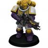
geektom Posted January 12, 2014 Author Share Posted January 12, 2014 Brother Chaplain Ko'soro Mai is finished! Tried several new things on him, so c/c is welcome! http://i109.photobucket.com/albums/n60/geektom/ChaplainonBikeFinished5_zps4cd3617d.jpg http://i109.photobucket.com/albums/n60/geektom/ChaplainonBikeFinished2_zps2c1d9698.jpg http://i109.photobucket.com/albums/n60/geektom/ChaplainonBikeFinished4_zpsedb97b15.jpg http://i109.photobucket.com/albums/n60/geektom/ChaplainonBikeFinished1_zps7d8306ca.jpg http://i109.photobucket.com/albums/n60/geektom/ChaplainonBikeFinished3_zps217d8ff3.jpg KBA and RolandTHTG 2 Back to top Link to comment Share on other sites More sharing options...
Tyrannicide Posted January 12, 2014 Share Posted January 12, 2014 Love the lightning bolt motif on the wheel well. Great conversion and painting. Well done, man. :tu: geektom 1 Back to top Link to comment Share on other sites More sharing options...
Barabbas Sogalon Posted January 12, 2014 Share Posted January 12, 2014 That is a great piece of work! You should be proud. geektom 1 Back to top Link to comment Share on other sites More sharing options...
Brother Heinrich Posted January 12, 2014 Share Posted January 12, 2014 Nice work man, I'd love to have Hashec go toe-to-toe with this dude. geektom 1 Back to top Link to comment Share on other sites More sharing options...
Iron Hands Fanatic Posted January 13, 2014 Share Posted January 13, 2014 Dayum, that purple. Seriously, dude, the theming / painting / overall aesthetic of these guys rocks. Also, that chaplain dials the awesome up to 11 geektom 1 Back to top Link to comment Share on other sites More sharing options...
geektom Posted January 13, 2014 Author Share Posted January 13, 2014 Thanks, everyone! You are all so encouraging! Next up is a 5 man Assault Termie squad-- I am not quite sure what to do to customize them, so I may leave them "as is" except for the paint scheme and some lighting work on the fists of their power claws. I am sticking with the codex on their white helmets, too-- it will be interesting to see if the white shows well against the light gray (that everyone thinks is white). I am travelling for work all next week, so no updates until the 20th. Thank you for all the support-- don't feel like you just have to say nice things-- I am here to learn as well. Cheers! Link to comment Share on other sites More sharing options...
GhostMalone Posted January 13, 2014 Share Posted January 13, 2014 brother I mean it after this project join the boys in the heresy geektom 1 Back to top Link to comment Share on other sites More sharing options...
JeffTibbetts Posted January 13, 2014 Share Posted January 13, 2014 That turned out pretty much flawless! I love it! Little touches like the skull fingers and the servo skull just make this a real treat. The lightning and purple bring him right in with the rest of your army. And I see you actually DID weather the tires. I think it's just right, and a great balance between subtle yet noticeable. It's the right kind of weathering for your force, and will bridge the gap nicely if you want some on your vehicles. geektom 1 Back to top Link to comment Share on other sites More sharing options...
geektom Posted January 13, 2014 Author Share Posted January 13, 2014 brother I mean it after this project join the boys in the heresy :yes: Well, Jaspcat, I normally am a "white hat" kind of guy, but I am really intrigued by all the FW stuff... Link to comment Share on other sites More sharing options...
GhostMalone Posted January 13, 2014 Share Posted January 13, 2014 you know you want to geektom 1 Back to top Link to comment Share on other sites More sharing options...
RolandTHTG Posted January 13, 2014 Share Posted January 13, 2014 Looks really good! geektom 1 Back to top Link to comment Share on other sites More sharing options...
Chickenleg Posted January 13, 2014 Share Posted January 13, 2014 He is epic. geektom 1 Back to top Link to comment Share on other sites More sharing options...
NightHunters Posted January 13, 2014 Share Posted January 13, 2014 Agree with the above statement. Love the purple/black, very well done - but then so are the bone fingers (lovely touch that, soon to be seen on a Night hunter near you!). Great weathering, only thing that lets it down the tiniest wee little bit is the white tabard and blending there upon. Can't put my finger on why though, the yellow on the other hand is perfect. Can't wait for more! FTE geektom 1 Back to top Link to comment Share on other sites More sharing options...
geektom Posted January 14, 2014 Author Share Posted January 14, 2014 Agree with the above statement. Love the purple/black, very well done - but then so are the bone fingers (lovely touch that, soon to be seen on a Night hunter near you!). Great weathering, only thing that lets it down the tiniest wee little bit is the white tabard and blending there upon. Can't put my finger on why though, the yellow on the other hand is perfect. Can't wait for more! FTE NH, thanks for the comments. The "white" that I use is actually light gray, but I can't seem to capture it in the pictures- maybe it looks wrong because the shading is too warm/brown to be used when you see it as white? Also, my sculpting of the tabard around the waist and the sash was not as smooth as it could have been- because of that, I think the extra "texture" makes the highlighting look less accomplished. I know it didn't feel great when I was painting it, anyway. Next up are some assault termies that will actually have white heads- I hope they look distinct enough from the gray armor, or I may have to choose a different color for 1st Brotherhood / Veterans. Link to comment Share on other sites More sharing options...
NightHunters Posted January 14, 2014 Share Posted January 14, 2014 You know it could well be the texture brother! I know I have had many an issue with just that! Look forward to seeing those Termies, white should look great me thinks! geektom 1 Back to top Link to comment Share on other sites More sharing options...
geektom Posted January 14, 2014 Author Share Posted January 14, 2014 You know it could well be the texture brother! I know I have had many an issue with just that! Yeah, I think I am just not aggressive enough with sanding/filing it once it totally hardens. Link to comment Share on other sites More sharing options...
geektom Posted January 17, 2014 Author Share Posted January 17, 2014 (edited) Soooooo.... Here on my work trip I found a box of devastators for $8 less than I normally see them. It was only afte I started to put them together that I realized it was "older" box (2012). Boy, the quality kinda sucks. Parts don't match up, the flash lines are terrible, details are not crisp- I wonder if it is even worth putting them together. Were all the last generation this bad, or did I just get a bad box? Edited January 17, 2014 by geektom Link to comment Share on other sites More sharing options...

Recommended Posts
Create an account or sign in to comment
You need to be a member in order to leave a comment
Create an account
Sign up for a new account in our community. It's easy!
Register a new accountSign in
Already have an account? Sign in here.
Sign In Now