Aeternus Posted July 26, 2022 Share Posted July 26, 2022 As always, loving the tones you use on the blue and gold, but I definitely see your issue - it's all just weirdly blending together almost imo. Out of the options you've outlined I'd probably echo NoFoesRemain with heavily shading certain parts of the blue, but alternatively have you considered just having the crescent pieces black, while leaving the 'underpad' blue? To me it feels like those crescent pieces are the main offenders in having the blue all blend together, providing as they are a sort of link between the underpad, arms and torso. Just the crescents may provide a lesser alternative to your #3, but even that entire plan I think would work well - the seekers main 'standout' is the helm and prominent main shoulder pad. Without the helm being black, and with the main pads covered with other colours, I think any similarities should be easily avoided. SkimaskMohawk 1 Back to top Link to comment https://bolterandchainsword.com/topic/363129-30k-hobby-chat/page/80/#findComment-5850152 Share on other sites More sharing options...
SkimaskMohawk Posted July 27, 2022 Share Posted July 27, 2022 1 hour ago, Aeternus said: As always, loving the tones you use on the blue and gold, but I definitely see your issue - it's all just weirdly blending together almost imo. Out of the options you've outlined I'd probably echo NoFoesRemain with heavily shading certain parts of the blue, but alternatively have you considered just having the crescent pieces black, while leaving the 'underpad' blue? To me it feels like those crescent pieces are the main offenders in having the blue all blend together, providing as they are a sort of link between the underpad, arms and torso. Just the crescents may provide a lesser alternative to your #3, but even that entire plan I think would work well - the seekers main 'standout' is the helm and prominent main shoulder pad. Without the helm being black, and with the main pads covered with other colours, I think any similarities should be easily avoided. I'm a little hesitant to have the middle part stay blue while the crescents change. I can't quite explain why; it just doesn't work well in my mind. I'll try refining the blue and see how I like it; if not, it's on to black; if even that doesn't work, then it's probably option #4. Aeternus 1 Back to top Link to comment https://bolterandchainsword.com/topic/363129-30k-hobby-chat/page/80/#findComment-5850168 Share on other sites More sharing options...
Irate Khornate Posted July 27, 2022 Share Posted July 27, 2022 5 hours ago, SkimaskMohawk said: I'm working on Sevatar and have a dilemma. His lower shoulder pad parts aren't really standing out to me, and just blending into the rest of the blue armour. I have a few options to solve this problem: 1. Glaze more blue in and make a stronger gradient This might be the most obvious; the blue hasn't had any touchups past it's initial pass and is still a bit rough. 2. Make the middle part (between the trim and the crescents) gold. It would reinforce the artificered nature of the armour and help frame the unique crescent parts of the shoulders. Also I'm going to have to go through the gold mix anyways to capture all the scrollwork (thanks camera, I wasn't sure if it was just ink splatters). 3. Make the middle and crescents black to match the upper pads. This would definitely break up the blue, but I'm also worried about using too much black and undermining the seekers use of it. 4. Combine #2 & #3. This would help reduce the amount of black, still add to the artificed look, and define the areas. Really would appreciate any thoughts! You could always do some dry brushing of lead belcher around the plate edges and give it a weathered look while making them stand out SkimaskMohawk 1 Back to top Link to comment https://bolterandchainsword.com/topic/363129-30k-hobby-chat/page/80/#findComment-5850180 Share on other sites More sharing options...
SkimaskMohawk Posted July 27, 2022 Share Posted July 27, 2022 52 minutes ago, Irate Khornate said: You could always do some dry brushing of lead belcher around the plate edges and give it a weathered look while making them stand out Thanks, but I'm not going to add weathering with metalics to these guys. Doesn't play the best with the gold being highlighted up to silver itself. Link to comment https://bolterandchainsword.com/topic/363129-30k-hobby-chat/page/80/#findComment-5850186 Share on other sites More sharing options...
OttoVonAwesome Posted July 27, 2022 Share Posted July 27, 2022 I think "blacklining" shading the blue down where the parts connect is the simplest solution. SkimaskMohawk 1 Back to top Link to comment https://bolterandchainsword.com/topic/363129-30k-hobby-chat/page/80/#findComment-5850191 Share on other sites More sharing options...
GarvielEisenhorn Posted July 27, 2022 Share Posted July 27, 2022 Quick and dirty test of an idea I had for miniature razor wire as Butcher's Nails. Thoughts? Doghouse, tinpact, Chaeron and 2 others 5 Back to top Link to comment https://bolterandchainsword.com/topic/363129-30k-hobby-chat/page/80/#findComment-5850212 Share on other sites More sharing options...
Pearson73 Posted July 27, 2022 Share Posted July 27, 2022 @SkimaskMohawk I reckon you should try with option 1 and vary the blues, or go for black. @GarvielEisenhorn Looks great! Link to comment https://bolterandchainsword.com/topic/363129-30k-hobby-chat/page/80/#findComment-5850223 Share on other sites More sharing options...
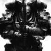
GarvielEisenhorn Posted July 27, 2022 Share Posted July 27, 2022 What started as a proof-of-concept for the nails turned into face painting practice. jaxom, WrathOfTheLion, Shovellovin and 12 others 15 Back to top Link to comment https://bolterandchainsword.com/topic/363129-30k-hobby-chat/page/80/#findComment-5850234 Share on other sites More sharing options...
dicebod Posted July 27, 2022 Share Posted July 27, 2022 I think that's super effective @GarvielEisenhorn. Looks great with paint! Link to comment https://bolterandchainsword.com/topic/363129-30k-hobby-chat/page/80/#findComment-5850389 Share on other sites More sharing options...
Xenith Posted July 27, 2022 Share Posted July 27, 2022 20 hours ago, SkimaskMohawk said: I see what you're talking about - is it the same in person, or accentuated by the photo? I'd adding my voice to deeper shading on the blue where it joins the arm. If that doesnt give a satisfactory result, I'd go gold with it. Link to comment https://bolterandchainsword.com/topic/363129-30k-hobby-chat/page/80/#findComment-5850408 Share on other sites More sharing options...
Pacific81 Posted July 27, 2022 Share Posted July 27, 2022 Just a bit of fun with some terrain - BA Rhino drives too fast, goes into toxic swamp tinpact, Doctor Perils and Chaeron 2 1 Back to top Link to comment https://bolterandchainsword.com/topic/363129-30k-hobby-chat/page/80/#findComment-5850427 Share on other sites More sharing options...
SkimaskMohawk Posted July 27, 2022 Share Posted July 27, 2022 1 hour ago, Xenith said: I see what you're talking about - is it the same in person, or accentuated by the photo? I'd adding my voice to deeper shading on the blue where it joins the arm. If that doesnt give a satisfactory result, I'd go gold with it. It's actually worse in person, because the details are naturally harder to see lol. Still haven't had time to put any paint on the model to see one way or another. Link to comment https://bolterandchainsword.com/topic/363129-30k-hobby-chat/page/80/#findComment-5850440 Share on other sites More sharing options...
Sherrypie Posted July 27, 2022 Share Posted July 27, 2022 That's hilarious, @Pacific81 :D On my end, staff sergeant-moritat Sternberg is finished and very, very pissed. You get a rad grenade! You get a rad grenade! EVERYBODY GETS A RAD GRENADE! I have a bit of a problem with Destroyers often being painted black, given the fluff of them just not giving a toss about various burn marks and such on their person. Especially in Death Guard, where even the regular fellas don't bother painting their ceramite. With this model, the body of the giant pizza shovel praetor was already too busy to go ham with such marks so that experiment shall wait a bit more. Doctor Perils, WrathOfTheLion, Pacific81 and 10 others 13 Back to top Link to comment https://bolterandchainsword.com/topic/363129-30k-hobby-chat/page/80/#findComment-5850443 Share on other sites More sharing options...
tinpact Posted July 27, 2022 Share Posted July 27, 2022 @SkimaskMohawk After looking at the Sevatar on the web store, it's not that different - but I think how saturated the blue is might be throwing it off? I agree that you might want to fade it to a darker color, or throw in some more bone and red. Link to comment https://bolterandchainsword.com/topic/363129-30k-hobby-chat/page/80/#findComment-5850467 Share on other sites More sharing options...
SkimaskMohawk Posted July 27, 2022 Share Posted July 27, 2022 31 minutes ago, tinpact said: @SkimaskMohawk After looking at the Sevatar on the web store, it's not that different - but I think how saturated the blue is might be throwing it off? I agree that you might want to fade it to a darker color, or throw in some more bone and red. Saturation shouldn't be a problem as long as long as you can preserve volume. I'm thinking that the various raised surfaces and kinda rushed airbrush application just didn't mix too well, and needs a lot of old fashioned brush work to make it look correct. Link to comment https://bolterandchainsword.com/topic/363129-30k-hobby-chat/page/80/#findComment-5850485 Share on other sites More sharing options...
Axineton Posted July 27, 2022 Share Posted July 27, 2022 On 7/24/2022 at 4:09 PM, Chaeron said: That’s a superb breakdown @Gederas - always find that useful when looking at boxes to see what I can use or repurpose. I’m sure others will find that very helpful too. I’ve found it a great start to a new Legion so far! Yep was a great breakdown and has probably convinced me to get the box maybe next month for my birthday and to maybe add a few bits to it too. tinpact 1 Back to top Link to comment https://bolterandchainsword.com/topic/363129-30k-hobby-chat/page/80/#findComment-5850499 Share on other sites More sharing options...
bushman101 Posted July 27, 2022 Share Posted July 27, 2022 1st 10 tacts for Spartan duty tinpact, Marshal Mittens, Chaeron and 2 others 5 Back to top Link to comment https://bolterandchainsword.com/topic/363129-30k-hobby-chat/page/80/#findComment-5850546 Share on other sites More sharing options...
tinpact Posted July 28, 2022 Share Posted July 28, 2022 1 hour ago, SkimaskMohawk said: Saturation shouldn't be a problem as long as long as you can preserve volume. Oh yeah, he's very flatly blue at the moment. The blue is just a really strong color to the point it fights with the gold for dominance. Also - I think the bit around the collar should be gold as well to keep his head separate from his chest. SkimaskMohawk 1 Back to top Link to comment https://bolterandchainsword.com/topic/363129-30k-hobby-chat/page/80/#findComment-5850587 Share on other sites More sharing options...
sarabando Posted July 28, 2022 Share Posted July 28, 2022 Working on some space vampires, can't wait to add having to explain the colours every time I post them XD why can't I do common things?! Doctor Perils, Chaeron, Pacific81 and 2 others 5 Back to top Link to comment https://bolterandchainsword.com/topic/363129-30k-hobby-chat/page/80/#findComment-5850628 Share on other sites More sharing options...
Marshal Mittens Posted July 28, 2022 Share Posted July 28, 2022 Can Space Marine Legions use Kastelan Robots in 30k? I have a few left over from a 40k project a while ago, and was thinking of building them for my legion. Pacific81 1 Back to top Link to comment https://bolterandchainsword.com/topic/363129-30k-hobby-chat/page/80/#findComment-5850664 Share on other sites More sharing options...
Pacific81 Posted July 28, 2022 Share Posted July 28, 2022 35 minutes ago, Marshall Mittens said: Can Space Marine Legions use Kastelan Robots in 30k? I have a few left over from a 40k project a while ago, and was thinking of building them for my legion. Outside of the restraints of any official 30k rules you definitely can Marshal Mittens 1 Back to top Link to comment https://bolterandchainsword.com/topic/363129-30k-hobby-chat/page/80/#findComment-5850669 Share on other sites More sharing options...
frankendoodle65 Posted July 28, 2022 Share Posted July 28, 2022 Just finished both of the praetors from the age of darkness box set. I've made a few tweaks to them, most notably the axe guy lost his axe and upgraded to terminator armour. More pictures are in my log over in the WIP forum. tinpact, Pacific81, Mandragola and 9 others 12 Back to top Link to comment https://bolterandchainsword.com/topic/363129-30k-hobby-chat/page/80/#findComment-5850671 Share on other sites More sharing options...
SkimaskMohawk Posted July 28, 2022 Share Posted July 28, 2022 Thanks everyone who took the time to provide feedback on sevatars armour! I had the time to touch up the blue, and it's pretty clear to see that it helped a lot, and the shoulder pad layers are distinct now. I also lined some other shadows in a bit better (like around the gorget), and re-highlighted some edges for a sharper finish. One thing with the ink I use to get the blue is that its finish is rather glossy, so highlights can be a bit rough to place initially. Still a lot left to do on the model. Marshal Mittens, Aeternus, GodEmperorOfMankind and 5 others 8 Back to top Link to comment https://bolterandchainsword.com/topic/363129-30k-hobby-chat/page/80/#findComment-5850803 Share on other sites More sharing options...
Vazzy Posted July 28, 2022 Share Posted July 28, 2022 First Ten Blood Angels done. I’ve mostly transitioned to skirmish games at this point so I’m a little worried I no longer have the endurance to do a full army anymore hahah. BadgersinHills, Loquille, Marshal Mittens and 5 others 8 Back to top Link to comment https://bolterandchainsword.com/topic/363129-30k-hobby-chat/page/80/#findComment-5850811 Share on other sites More sharing options...
Mandragola Posted July 28, 2022 Share Posted July 28, 2022 (edited) I’m still bashing away at ravenguard. I’ve built my second tactical squad, a couple of apothecaries, all the dark furies and 1.5 of my recon squads. Quite a lot of this stuff has now been primed, had its contrast layer and is starting to get details done, starting with the metal. For a bit of a break from the churn I have been painting this contemptor over the past couple of days. I’ve added the transfers now, arguably a bit early as there’s still work to do on the metal parts. Nearly there though. Theres still stuff I’m trying to figure out, like what exactly my army list will be. Units like a Xiphon, predators and various characters - who I may or may not have a plan to build - keep drifting in and out of my lists. I think I know how I’m going to add melta blastgun to some ancient mars-class predators that I’ve got. Edited July 28, 2022 by Mandragola BadgersinHills and Chaeron 2 Back to top Link to comment https://bolterandchainsword.com/topic/363129-30k-hobby-chat/page/80/#findComment-5850938 Share on other sites More sharing options...
Recommended Posts
Create an account or sign in to comment
You need to be a member in order to leave a comment
Create an account
Sign up for a new account in our community. It's easy!
Register a new accountSign in
Already have an account? Sign in here.
Sign In Now