hushrong Posted November 2, 2014 Share Posted November 2, 2014 This thread is quite the nightmare factory. Link to comment Share on other sites More sharing options...
Flint13 Posted November 2, 2014 Share Posted November 2, 2014 I totally approve of the direction blingy chrome marine is headed in ^_^ Link to comment Share on other sites More sharing options...
Slips Posted November 2, 2014 Share Posted November 2, 2014 Yeah so my eyes hurt when I looked at the Neon Marine... Good Job! Totally what I was hoping for with Neon :p Link to comment Share on other sites More sharing options...
Forté Posted November 2, 2014 Author Share Posted November 2, 2014 This thread is quite the nightmare factory.:D just made my morning.I totally approve of the direction blingy chrome marine is headed in ^_^The metal is about as bright as I could get it. Just thinking on colours for the weapon casings and hair to go with it now. Yeah so my eyes hurt when I looked at the Neon Marine... Good Job! Totally what I was hoping for with Neon :p More to come too with the other four. The neon is actually a bit brighter as these pics are pretty poor. Link to comment Share on other sites More sharing options...
Grizzly_bear Posted November 2, 2014 Share Posted November 2, 2014 Fabtastic thread brother Link to comment Share on other sites More sharing options...
Forté Posted November 2, 2014 Author Share Posted November 2, 2014 Fabtastic thread brotherMany thanks. Got a few days off this week so fingers crossed for more painting :D Grizzly_bear and Psy-Crow 2 Back to top Link to comment Share on other sites More sharing options...
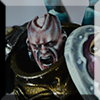
Kizzdougs Posted November 2, 2014 Share Posted November 2, 2014 Awesome stuff bro! The chrome marine is particularly excellent. Which paint did you use to achieve the super clean/bright silver armour? Link to comment Share on other sites More sharing options...
Forté Posted November 2, 2014 Author Share Posted November 2, 2014 (edited) Awesome stuff bro! The chrome marine is particularly excellent. Which paint did you use to achieve the super clean/bright silver armour?This is what I did for that one: VMA Chrome base. Shadows added with GW Leviathan Purple and AV Glaze Medium. Line gaps between armour with old 90's GW Armour Wash. Wash some thinned GW Asurman Blue wash into dark areas. First highlight with VMA Chrome. 2nd highlight with Chrome + Metallic Medium (approx 60/40). 3rd highlight approx 30/70 Chrome/Metallic Medium. 4th highlight with pure Metallic Medium 5th with 50/50 Metallic Medium/VMA White on the edge points where light would hit. Final dots on eedge tips using pure VMA White. I need to get a life lol. I aim to highlight in a Zenithal style for gaming pieces as I like a sense of light coming from above. I'll add too that I didn't thin the Chrome at any point either. The Model Air paints that I've tried so far are pretty perfect straight from the bottle and the metallic went on so smoothly. I'm sold for sure. I used the white for highlighting the neon marine too. No colour mixing with it as it went on thin and smooth and built up well when glazed towards the edges too. EDIT: Forgot to mention that I never paint with a dry brush...well, unless I'm drybrushing. I did that whole session with a sable size 1 brush and washed it before painting so the bristles were moist to let the paint flow better. And I always touch the brush on some kitchen roll after loading up with paint to remove excess. Edited November 2, 2014 by forte Kizzdougs 1 Back to top Link to comment Share on other sites More sharing options...
Augustus b'Raass Posted November 2, 2014 Share Posted November 2, 2014 I like 'm both Forte. It's scary to me to paint light colours, because I find them so difficult to do - and you seem to have mastered it perfectly. :tu: Link to comment Share on other sites More sharing options...
Forté Posted November 2, 2014 Author Share Posted November 2, 2014 I like 'm both Forte. It's scary to me to paint light colours, because I find them so difficult to do - and you seem to have mastered it perfectly. :tu: You know why I've ended up doing bright colours. Years of painting dark schemes. I also find it a challenge to paint in a clean way too. I do want to push myself on textures, shadows, and free hand as I've avoided it. Link to comment Share on other sites More sharing options...
ppotts Posted November 2, 2014 Share Posted November 2, 2014 no need to panic i had my sugar today really liking the reworking greenstuff on the spawn head and is the 40 mm base also chromed as it looks like a large plate of metal,if so thats a really cool effect Link to comment Share on other sites More sharing options...
Forté Posted November 2, 2014 Author Share Posted November 2, 2014 no need to panic i had my sugar today really liking the reworking greenstuff on the spawn head and is the 40 mm base also chromed as it looks like a large plate of metal,if so thats a really cool effect Don't worry, I rarely panic on B&C these days. I moderate instead ;) Cheers. I really need to thank whoever it was who mentioned that it didn't look the part originally or I wouldn't have made the changes. The 40mm base for the spawn has a couple of brass bits from the GW basing kit but they are painted differently to the Chrome marine. The metal parts on the base were started with Boltgun Metal. Heavily washed with the old Armour Wash, then with some old Chestnut wash mixed with the AW directly on the parts. But more AW added to areas I wanted that bit darker. Once dry I used a medium drybrush to almost stiple/drybrush the areas I wanted lighter. This I built up to chrome on the edges. With that I don't use a pallet but put the paint straight onto a paper towel and mix the colours as I wipe it off the brush. Good fun too. And I do like to play with washes for certain. Link to comment Share on other sites More sharing options...
daemonclaw Posted November 2, 2014 Share Posted November 2, 2014 hey hey forte its been a while since i stopped off here,just to echo what others have said the new greenywork on the head hits the nail on the errr head glad to see you embracing the green side let it flow and consume you .youll soon be doing full sculpts also a nice change of direction with the chrome and congrats for not making it look plasticky as seems to happen so often with shiny metallic paint Link to comment Share on other sites More sharing options...
Forté Posted November 2, 2014 Author Share Posted November 2, 2014 its been a while since i stopped off here I blame you too for me investing in a cable maker ;) Cheers. I hope to see some Call of Chaos craziness from yourself :tu: daemonclaw 1 Back to top Link to comment Share on other sites More sharing options...
daemonclaw Posted November 2, 2014 Share Posted November 2, 2014 its been a while since i stopped off here I blame you too for me investing in a cable maker Cheers. I hope to see some Call of Chaos craziness from yourself im sure it will keep you more entertained than a kid at xmas Forté 1 Back to top Link to comment Share on other sites More sharing options...
Midnightmare Posted November 2, 2014 Share Posted November 2, 2014 Nice work on the NM so far dude, liking them long time, but that spawn is especially disturbing. Win! Forté 1 Back to top Link to comment Share on other sites More sharing options...
Forté Posted November 8, 2014 Author Share Posted November 8, 2014 (edited) Well. While working on a certain Secret Santa for SlavetoDarkness last night I managed to slap a bit more paint on the first two Noise Marines. Not quite the eye melters I was planning but there are still four more to play with so feel free to throw in some C&C. Although I'm tempted to try and do the Champion in a light marble colour. Thank you for stopping by and hopefully your Call of Chaos (or any other painting or modelling project) is going well for you :thanks: :tu: Edited November 8, 2014 by forte Machine God and Psy-Crow 2 Back to top Link to comment Share on other sites More sharing options...
Grizzly_bear Posted November 8, 2014 Share Posted November 8, 2014 Very nice brother. May I ask have you posted that half scheme on facebook? I seem to think ive seen that on a page on FB? Link to comment Share on other sites More sharing options...
Augustus b'Raass Posted November 8, 2014 Share Posted November 8, 2014 As always, the crispiness of the paint job is eye-watering. The white slaaneshi symbol on the pink armour is just... amazing. Seriously.... I hate you a little. Nitty-picketty-party-poop: the blue trim on the pink shoulder pad doesn't do it for me. I get that you're going for a contrasting colour on the colour wheel, but the tone of the colour is somehow off. Perhaps pastel blue would have been a better choice on the pinky-greeny guy? It *does* work on the metal one, which actually could use a little more imo :D - bone on the bony areas or something like that. No pun intended!!!! Beautiful work, forte - you're at it again! :tu: Link to comment Share on other sites More sharing options...
Forté Posted November 8, 2014 Author Share Posted November 8, 2014 Very nice brother. May I ask have you posted that half scheme on facebook? I seem to think ive seen that on a page on FB?Sure have. Think that was the Eavier Metal one (good group too). Link to comment Share on other sites More sharing options...
Forté Posted November 8, 2014 Author Share Posted November 8, 2014 As always, the crispiness of the paint job is eye-watering. The white slaaneshi symbol on the pink armour is just... amazing. Seriously.... I hate you a little. Nitty-picketty-party-poop: the blue trim on the pink shoulder pad doesn't do it for me. I get that you're going for a contrasting colour on the colour wheel, but the tone of the colour is somehow off. Perhaps pastel blue would have been a better choice on the pinky-greeny guy? It *does* work on the metal one, which actually could use a little more imo :D - bone on the bony areas or something like that. No pun intended!!!! Beautiful work, forte - you're at it again! :tu: Don't panic. The blue trim is only the base and shade. Highlights still to be done. And the trim on the Chrome one is purple (but shaded blue so I'll let you off). The white patterns are done with VMA White. No thinning either. Flows nicely from a brush too. Suppose I need to try more free hand stuff with these too. Kierdale and Augustus b'Raass 2 Back to top Link to comment Share on other sites More sharing options...
Kizzdougs Posted November 8, 2014 Share Posted November 8, 2014 Wow! The freehand on the leg of that noise marine is awesome! The subtly and detail is excellent Link to comment Share on other sites More sharing options...
Forté Posted November 8, 2014 Author Share Posted November 8, 2014 Wow! The freehand on the leg of that noise marine is awesome! The subtly and detail is excellent Coming from you I take that as a great compliment :thanks: Kizzdougs 1 Back to top Link to comment Share on other sites More sharing options...
Grizzly_bear Posted November 8, 2014 Share Posted November 8, 2014 Very nice brother. May I ask have you posted that half scheme on facebook? I seem to think ive seen that on a page on FB?Sure have. Think that was the Eavier Metal one (good group too). Knew I had seen it bar this forum. Next time you post I'll be sure to add you on there Forté 1 Back to top Link to comment Share on other sites More sharing options...
Psy-Crow Posted November 8, 2014 Share Posted November 8, 2014 That freehand is shaping up nicely. Where do you get your paints? is online or from a shop as the only shop in London I've found knocking out Vallejo range is Darksphere and its a bit of a journey for me. I know getting them online isn't an issue but I like to see new colours before buying. Link to comment Share on other sites More sharing options...

Recommended Posts
Create an account or sign in to comment
You need to be a member in order to leave a comment
Create an account
Sign up for a new account in our community. It's easy!
Register a new accountSign in
Already have an account? Sign in here.
Sign In Now