daemonclaw Posted June 14, 2014 Share Posted June 14, 2014 looking as smooth as a cashmere codpieceNow there's an idea! http://i2.photobucket.com/albums/y30/daemonclaw/tumblr_lhge0gP0od1qcy1poo1_r1_500_zps06284537.gif mmmmmm indeed Forté and Squeaky 2 Back to top Link to comment https://bolterandchainsword.com/topic/282983-fort%C3%A9s-creations-started-crimson-fists-pg-67/page/36/#findComment-3718672 Share on other sites More sharing options...
Slave to Darkness Posted June 14, 2014 Share Posted June 14, 2014 well, its a slaanesh tank, and thats a biiiig (shaven) gun... ill just leave that thought there Link to comment https://bolterandchainsword.com/topic/282983-fort%C3%A9s-creations-started-crimson-fists-pg-67/page/36/#findComment-3718816 Share on other sites More sharing options...
chaplainmikey Posted June 14, 2014 Share Posted June 14, 2014 The turquoise/ light blue looks really nice on the large areas of the Fiend. :) Link to comment https://bolterandchainsword.com/topic/282983-fort%C3%A9s-creations-started-crimson-fists-pg-67/page/36/#findComment-3718821 Share on other sites More sharing options...
Midnightmare Posted June 14, 2014 Share Posted June 14, 2014 Nice work on the fiend, it is really coming along now dude, big time. And the tank, I am interested in what colour you are going to go with for it as it is so big. One thing is for sure it is looking a beast (I wouldn't want to vow such a big kit!) Link to comment https://bolterandchainsword.com/topic/282983-fort%C3%A9s-creations-started-crimson-fists-pg-67/page/36/#findComment-3718822 Share on other sites More sharing options...
Forté Posted June 14, 2014 Author Share Posted June 14, 2014 well, its a slaanesh tank, and thats a biiiig (shaven) gun... ill just leave that thought thereCheers for that image...well...the one you mention too often on FB that is grrrrr. The turquoise/ light blue looks really nice on the large areas of the Fiend. :):thanks: was thinking of breaking up the biggest two plates on the back with a marble pattern maybe. Nice work on the fiend, it is really coming along now dude, big time. And the tank, I am interested in what colour you are going to go with for it as it is so big. One thing is for sure it is looking a beast (I wouldn't want to vow such a big kit!)I've been donated an old airbrush so fingers crossed I can use it for the most of it. And it's not going to be bright overall as I'm thinking an ash type camo for the most part with coloured additional details. Link to comment https://bolterandchainsword.com/topic/282983-fort%C3%A9s-creations-started-crimson-fists-pg-67/page/36/#findComment-3718836 Share on other sites More sharing options...
Midnightmare Posted June 14, 2014 Share Posted June 14, 2014 Whatever you go for, with the standard you are churning out at the moment, it is going to be a monster! Link to comment https://bolterandchainsword.com/topic/282983-fort%C3%A9s-creations-started-crimson-fists-pg-67/page/36/#findComment-3718838 Share on other sites More sharing options...
Forté Posted June 14, 2014 Author Share Posted June 14, 2014 Whatever you go for, with the standard you are churning out at the moment, it is going to be a monster!No pressure then. Slave to Darkness and Midnightmare 2 Back to top Link to comment https://bolterandchainsword.com/topic/282983-fort%C3%A9s-creations-started-crimson-fists-pg-67/page/36/#findComment-3718843 Share on other sites More sharing options...
Slave to Darkness Posted June 14, 2014 Share Posted June 14, 2014 none at all lol Link to comment https://bolterandchainsword.com/topic/282983-fort%C3%A9s-creations-started-crimson-fists-pg-67/page/36/#findComment-3718845 Share on other sites More sharing options...
Squeaky Posted June 14, 2014 Share Posted June 14, 2014 well, its a slaanesh tank, and thats a biiiig (shaven) gun... ill just leave that thought there That's what she said.... Anyway great stuff the fiend looks rather dapper with a bright colour on and the marble would only add to the bespoke look lol Link to comment https://bolterandchainsword.com/topic/282983-fort%C3%A9s-creations-started-crimson-fists-pg-67/page/36/#findComment-3718904 Share on other sites More sharing options...
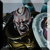
Bam-AoD Posted June 15, 2014 Share Posted June 15, 2014 Really loving that sorcerer mate. Forté 1 Back to top Link to comment https://bolterandchainsword.com/topic/282983-fort%C3%A9s-creations-started-crimson-fists-pg-67/page/36/#findComment-3719055 Share on other sites More sharing options...
Forté Posted June 15, 2014 Author Share Posted June 15, 2014 Just a tester but how would this look on my finished pictures? And an example C&C looked for please. Cheers ;) Kizzdougs 1 Back to top Link to comment https://bolterandchainsword.com/topic/282983-fort%C3%A9s-creations-started-crimson-fists-pg-67/page/36/#findComment-3719329 Share on other sites More sharing options...
Kizzdougs Posted June 15, 2014 Share Posted June 15, 2014 Looks good bro. It really adds a level of professionalism to the image :) If I had to make one critical remark it would be that the lettering is difficult to read when its in the smaller format. Maybe a different font, background or colouring for the letters would help add some definition. Then again, people will come to recognise the watermark regardless, and therefore it will have fulfilled it's intended purpose. Link to comment https://bolterandchainsword.com/topic/282983-fort%C3%A9s-creations-started-crimson-fists-pg-67/page/36/#findComment-3719332 Share on other sites More sharing options...
Forté Posted June 15, 2014 Author Share Posted June 15, 2014 Being honest, that was one of the things I wasn't too sure of. Now that I've seen how it looks I know that is one thing that needs tweaking. The background too I think. Maybe simplify it a bit too. Link to comment https://bolterandchainsword.com/topic/282983-fort%C3%A9s-creations-started-crimson-fists-pg-67/page/36/#findComment-3719339 Share on other sites More sharing options...
Darth Mustard Posted June 15, 2014 Share Posted June 15, 2014 Comments : It´s good. For a logo on the main page of a website. Critics : It´s a little too busy for a tiny logo to be inserted on photos. I can´t really read your name in the logo and I already know it´s yours. The busy dark electrical sky background takes is the first thing one notice and note your name. The 2 circles with the shading lost me. They kind of make me associate it immediately the Ford logo.... Sorry. I don´t mean to snipe your work. I would drastically simplify it. Your models are very colorful so I would do a silver, black and white or only black logo. The font is original. I would keep a big ass F and smaller "orte" letters. After all it means strong. It is a statement. I would thicken the font. Turn your F into the S of the superman logo. Everybody knows who is wearing it and what it stands for. Your F is versatile. You can turn it into chaos, Slaneesh or whatever you feel like to. Sorry a lot of critics to take in but it is my humble opinion. Cheers, F-man :) Forté 1 Back to top Link to comment https://bolterandchainsword.com/topic/282983-fort%C3%A9s-creations-started-crimson-fists-pg-67/page/36/#findComment-3719341 Share on other sites More sharing options...
Forté Posted June 15, 2014 Author Share Posted June 15, 2014 @Darth Mustard. I asked didn't I and everything you say does make sense. The main thing that really makes sense is the comment about the size. Large, it works (with a bit more fading in places) but small it is too complex. I'll play around with size and shades. Reduce the colours involved in a smaller version. Link to comment https://bolterandchainsword.com/topic/282983-fort%C3%A9s-creations-started-crimson-fists-pg-67/page/36/#findComment-3719349 Share on other sites More sharing options...
Forté Posted June 15, 2014 Author Share Posted June 15, 2014 Went for another mock up for a watermark Kizzdougs, Warsmith Aznable, deathspectersgt7 and 2 others 5 Back to top Link to comment https://bolterandchainsword.com/topic/282983-fort%C3%A9s-creations-started-crimson-fists-pg-67/page/36/#findComment-3719390 Share on other sites More sharing options...
YoungWolf7 Posted June 15, 2014 Share Posted June 15, 2014 Better, but I would go a bit smaller. With the black in it it has a lot more visual "weight" and draws the eye away from the actual subject of the picture, which is the minis themselves. Less is always more in cases like these. Personally I would just go for the stylized "F" as suggested above, maybe a simple drop shadow to help it stand off the background. You don't need more than that. :) Link to comment https://bolterandchainsword.com/topic/282983-fort%C3%A9s-creations-started-crimson-fists-pg-67/page/36/#findComment-3719509 Share on other sites More sharing options...
batu Posted June 15, 2014 Share Posted June 15, 2014 I like the second one more. Link to comment https://bolterandchainsword.com/topic/282983-fort%C3%A9s-creations-started-crimson-fists-pg-67/page/36/#findComment-3719514 Share on other sites More sharing options...
Forté Posted June 15, 2014 Author Share Posted June 15, 2014 Smaller is possible. So is playing with the opacity too. I do need to look at the finish on the F though. Doesn't look as good as the first. Enigami 1 Back to top Link to comment https://bolterandchainsword.com/topic/282983-fort%C3%A9s-creations-started-crimson-fists-pg-67/page/36/#findComment-3719617 Share on other sites More sharing options...
Squeaky Posted June 15, 2014 Share Posted June 15, 2014 I think the second is heading in the right direction maybe lessen the shadow on the rim so it isnt silver and black once its down to size the edges should soften anyway :) Cool idea did you do the F yourself? Link to comment https://bolterandchainsword.com/topic/282983-fort%C3%A9s-creations-started-crimson-fists-pg-67/page/36/#findComment-3719661 Share on other sites More sharing options...
Olis Posted June 15, 2014 Share Posted June 15, 2014 Squeaky, I had to read your post twice just to be sure you weren't being rude... :lol: Squeaky and Dragonkin Arenis 2 Back to top Link to comment https://bolterandchainsword.com/topic/282983-fort%C3%A9s-creations-started-crimson-fists-pg-67/page/36/#findComment-3719663 Share on other sites More sharing options...
Squeaky Posted June 15, 2014 Share Posted June 15, 2014 (edited) Squeaky, I had to read your post twice just to be sure you weren't being rude... lol... me rude never crossed my mind not like im jealous of forte's skills :P Edited June 15, 2014 by Squeaky Link to comment https://bolterandchainsword.com/topic/282983-fort%C3%A9s-creations-started-crimson-fists-pg-67/page/36/#findComment-3719668 Share on other sites More sharing options...
Forté Posted June 15, 2014 Author Share Posted June 15, 2014 The F is how an uppercase F comes out in one of my fonts on CS6. When I'm on the pc next I'll see which it is. Going to get on with painting now but may have another go at the logo tomorrow. Link to comment https://bolterandchainsword.com/topic/282983-fort%C3%A9s-creations-started-crimson-fists-pg-67/page/36/#findComment-3719679 Share on other sites More sharing options...
Squeaky Posted June 15, 2014 Share Posted June 15, 2014 The F is how an uppercase F comes out in one of my fonts on CS6. When I'm on the pc next I'll see which it is. Going to get on with painting now but may have another go at the logo tomorrow. Cool cheers Forte though i dont have CS6 :P Link to comment https://bolterandchainsword.com/topic/282983-fort%C3%A9s-creations-started-crimson-fists-pg-67/page/36/#findComment-3719704 Share on other sites More sharing options...
Kilofix Posted June 15, 2014 Share Posted June 15, 2014 Second logo but purple background perhaps? Link to comment https://bolterandchainsword.com/topic/282983-fort%C3%A9s-creations-started-crimson-fists-pg-67/page/36/#findComment-3719804 Share on other sites More sharing options...
Recommended Posts
Create an account or sign in to comment
You need to be a member in order to leave a comment
Create an account
Sign up for a new account in our community. It's easy!
Register a new accountSign in
Already have an account? Sign in here.
Sign In Now